10 Small Things Beginners Missed When Developing A Website
When you’re just starting to create a website, you’ll be bound to miss some small yet crucial things to include in your website.
In this article, I’ll include ten things that you should add to your site. Having them will significantly improve your online presence.
Let’s get started.
1. Optimize Website Speed
Google uses website speed as a ranking factor. Ideally, a website should take no longer than three seconds to load. If it goes above four seconds, it is deemed too slow, and Google won’t look favorably at your website, making it harder to rank high on search engines.
Google also stated that 53% of mobile site bounce rates are high when a site takes longer than three seconds to load.
As you’ve just started creating your site, this might not come across as a priority for you, but it should be. Here are some steps you can take to optimize your site’s speed:
- Optimize images.
- Minimize plugins.
- Use a content delivery network.
- Use faster plugins.
- Minify and compress CSS and JavaScript files.
- If the website is using WordPress, regularly update your WordPress site and plugins
- Empty WordPress Trash.
2. Use A Responsive Template
When you’re choosing a website builder, like Zyro, make sure that you choose one that already has optimization options built in.
Always make sure that the website builder’s templates have at least the following features included:
- Ensure it can easily adapt to desktop and mobile devices. Try choosing one that automatically optimizes your website for mobile devices.
- Unlimited bandwidth and storage.
- 99,9% guaranteed uptime.
- 24/7 support.
3. Pay Attention To Navigation
When visitors come to your website, they most likely already know what they want to do. Perhaps it is to get in touch with your business or looking for a specific product or service that you offer. Whatever the reason, you should make it easy for them to find what they need.
Here are some of the things you can do:
- Make sure you set up simple and straightforward navigation where there is a navigation menu or bar located either on the top or left side of the web page.
- Include a search bar on the top of the page so users can quickly type in what they’re looking for.
- Make all navigation elements clickable links and change the color of visited links, so users know where they’ve been.
- Use proper navigation names. For example, if it is an about us name, it will lead users to your business’s information page.
4. Use Enough Whitespace
When whitespace is used effectively, it improves readability, increases comprehension, maximizes clarity, and increases attention. Make good use of white space to make large blocks of text less intimidating.
When there isn’t enough whitespace, the page’s content will be overwhelming for visitors to read and comprehend. When there’s too much whitespace, visitors will find the page lacking and unpleasant to look at.
So make sure you use enough whitespace on your site. Ideally, try to see whether visitors can easily recognize and find what they’re looking for while still keeping it aesthetically pleasing to the eye. Ask your friends and family to review your site, using them as a focus group that might help identify poor design choices.
5. Upload A Favicon
Many of your visitors usually have a lot of tabs open on their web browser as they browse around. This can have many reasons. They might want to review it later or want to compare something from another site.
A favicon is a small pixel icon that serves as branding for your site. It helps visitors locate your site easier when they have multiple tabs open. In other words, a smaller version of your logo.
Uploading a favicon not only gives visitors a visual cue but also adds trust and legitimacy to your site.
6. Add Clear Calls-To-Action
After you’ve created straightforward navigation, you should also ensure that your visitors know their next step. Calls-to-action acts as a written prompt that aims to persuade visitors to complete a task.
Be very clear with your language. Call-to-action buttons should be to-the-point and use exact words to make it clear what they can do next. Here are some examples of calls-to-action:
- Get Started
- Add to Cart
- Contact Us Today
- Buy Now
- Apply Now
- Yes, Sign Me Up
7. Apply SEO Strategies
When you publish your site, you won’t immediately get traffic. One of the best ways to gain traffic is to rank high on search engine results pages (SERPs). To do that, you first need to adhere to the search engine ranking factors.
One way to help rank high is by practicing search engine optimization (SEO). This method helps improve your site’s ranking by:
- Using on-page SEO practices.
- Conducting keyword research.
- Utilize web analytics tools (which will be explained later in the article).
- Generate ideas so you can create content regularly.
- Improve titles and meta descriptions.
8. Make It Mobile-Friendly
Around 52.5% of the world’s population uses smartphones. It’s only natural that you adapt your website to be mobile-friendly. As we mentioned before, creating a responsive website is crucial.
One of the main reasons is that Google has adopted the mobile-first approach, which means that if your website isn’t mobile-friendly, don’t expect to rank high on search engines.
As mentioned earlier, make sure that your website builder allows you to easily optimize your site for mobile devices, be it phones or tablets. It’d be best if the builder automatically optimizes it for mobile. However, make sure to spend the time to test and check yourself.
9. Use High-Quality Image
It’s imperative to use high-quality images, especially when displaying your products or adding visual content to your blog. While it’s okay to use stock photography, original photos are still the better option.
Not only will it help add meaning to your content, but it will also help attract more visitors to your site.
However, bear in mind that search engines can’t “see” images, so you’ll need to add ALT texts, captions, file names, and title texts to help identify what’s on the image.
Also, remember that your images shouldn’t negatively impact your site’s speed and responsiveness. Thus refer back to the first two tips to see how you can optimize your images.
10. Analyze Website Performance
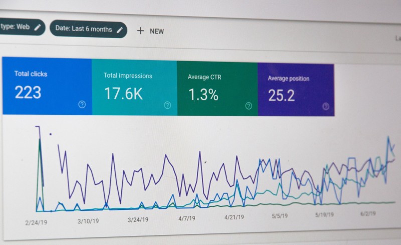
Don’t forget that you should regularly track web analytics. It’s the process of collecting and analyzing your website’s data.
By analyzing your site performance, you can see how effective your marketing efforts are, measure traffic, track your business goals, solve problems and improve your results.
Here are some of the analytics tools you can use:
Conclusion
Now you know the ten small things beginners tend to miss when creating a website. All that’s left to do is for you to include these things – if you haven’t already – on your site.
Remember that it all starts with having a solid foundation, so make sure you take your time when choosing the suitable template for your website.
Good luck!

8 Ways to Support Regulatory Compliance in Tech Firms

Law Firm Management: How Technology is Driving Efficiency


