
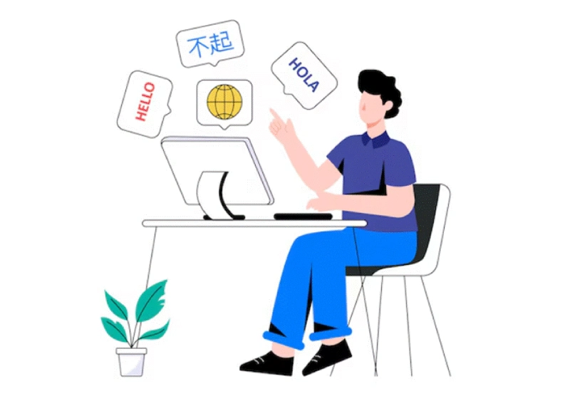
How Translating UI and UX Boosts Product Adoption Across Regions
Translating an app’s language is only part of making it work in a new region. When the layout feels unfamiliar, the icons are unclear, or the navigation doesn't match user expectations, people often disengage. Even if the words make sense, the experience can still feel wrong.
Successful global products do more than localize text. They adapt how the interface looks, feels, and functions. When UI and UX reflect how people in each region use and understand digital tools, the experience becomes more intuitive and trustworthy.
What UI and UX Translation Really Means
Translation goes beyond switching words from one language to another. It involves shaping the entire experience to feel natural and intuitive for users in each region. This includes screen layout, button placement, form behavior, label clarity, and tone.
Take a simple date format: “05/10/2025.” Is that May 10 or October 5? A second of confusion slows users down. If they hit that pause repeatedly, frustration builds.
Other common friction points include:
- Icons that carry different meanings across cultures
- Buttons placed in unexpected spots
- Help text that feels robotic or hasn’t been translated at all
- Layouts that bury what local users care about most
These aren’t software bugs, but they influence how people feel while navigating the product. Users rely on patterns that feel right. When those patterns break, engagement tends to drop.
Design That Respects Local Habits
Localizing an interface means thinking about how people interact, not just what they read. Each region has its own expectations, shaped by culture, language, and user behavior.
Consider these factors:
- Text direction. Right-to-left languages, such as Arabic or Hebrew, require mirrored layouts.
- Color associations. White may suggest purity in one culture and mourning in another.
- Icon meaning. A symbol that seems evident in one region might confuse someone elsewhere.
- Tone of voice. Some audiences expect short, direct instructions. Others prefer formal or polite phrasing.
- Screen density. In Japan, users may prefer more detailed dashboards. In the United States, many users tend to favor simplicity and open spaces.
These are design choices, not technical ones. They reflect how people navigate tools in their daily lives. When the interface meets those expectations, users feel at ease. They explore more and are more likely to return.
Observe, Don’t Assume
Most products are initially designed with a single user group in mind. That group usually reflects the first region the product targets. But once the product expands, early design decisions may fall short in new markets.
Assumptions about how users think and behave are rarely consistent across regions. The only way to know is to observe. Ask:
- Can users complete key tasks without getting stuck?
- Do they understand what each screen is asking them to do?
- Where do they pause, exit, or backtrack?
Sometimes a phrase reads awkwardly. Sometimes a color feels too harsh. Seemingly minor issues can create roadblocks when they pile up.
Let users choose what works best for them. Offer flexibility in language, date formats, and units of measurement. These minor adjustments help the product feel like it belongs to the person using it.
For companies navigating this process, it's essential to understand that localization affects every part of the user experience. From interface design to support content, complete adaptation requires careful attention to regional expectations, cultural norms, and real user behavior.
Localization Is an Ongoing Process
Launching a localized product isn’t the finish line. It’s the start of continuous improvement.
Monitor user responses across different regions. Look for signs such as:
- High drop-off rates during onboarding
- Frequent support requests about layout or unclear features
- Tools that are popular in one region but rarely used in another
Support content plays a role, too. Users turn to tooltips, help pages, and error messages when they’re stuck. These should be as thoughtfully adapted as the interface itself.
Templates and frameworks can speed up development, but they can't replace regional insight. Relying too heavily on one-size-fits-all solutions can lead to unmet expectations. Regular feedback should guide product updates. Localization works best as an embedded part of the product, not a surface-level adjustment.
What Makes People Keep Using a Product
People return to products that make sense to them. When a product reflects how they think, speak, and navigate, it becomes part of their routine.
An interface that speaks their language, matches what they expect to see, and guides them clearly creates trust. It removes barriers. Users move forward instead of pausing or giving up.
This is how adoption grows, not by stacking more features, but by creating experiences that fit from the very first tap.


Top UI/UX Design Agencies for B2B Websites in 2026

Onboarding Software Trends Every Firm Should Watch

How Last-Mile Delivery Tech Supports eCommerce Growth

Top Domain Registrars with Transparent Renewals